Power BI vs. Tableau vs. Qlik: Which BI Tool Comes Out on Top?

“Just give me the data.” When Kenway Consulting engages in a Business Intelligence (BI) project, many of them begin with that simple phrase— “Just give me the data.” Organizations want their data from various source systems in the hands of their power users. Doing so allows them to leverage the industry expertise and analytical mindsets for which they hired these resources. To maximize our value during a BI project, we believe in getting our clients the data that addresses their highest impact business questions early in the data discovery phase and then iteratively developing it in an in-memory data visualization tool.
We use in-memory analytics and data visualization tools because they allow:
- Data extraction from disparate data sources without undergoing a full, expensive extract-transform-load (ETL) project and/or data warehouse development project
- Users to manipulate the data to create custom fields, groupings, and flags without impacting source systems
- Charts, graphs, and filters to be modified on the fly so that we can develop side-by-side with our users, providing immediate feedback as they conceptualize what they need
However, just as no two clients’ needs are the same, we have learned that we cannot simply pick one tool to address every engagement. In an effort to best serve our clients, Kenway recently undertook a hands-on research project to vet Power BI vs Tableau vs Qlik. We deemed this little exercise…
Here is how it worked. We built a report in Qlik Sense, and used it to provide a benchmark against two major competitors: Microsoft Power BI and Tableau so we could compare Power BI vs Tableau vs Qlik. We reviewed the products on their ability to fulfill a few of the common use cases we have seen with our clients:
- Data Extraction
- Summary Dashboard Development
- Advanced in-memory analytics
Before we begin our intergalactic adventure in data, here is some background on the exercise:
- We used 9 Excel spreadsheets as our “data extracts” (if you have worked with the Adventure Works database, these will look very familiar)
- We limited our consultants to 15 hours of development; this is the amount of time that it took us to build the Qlik Sense benchmark with a multiplier to factor in our previous experience with the tool
- The specific tools that we used were:
- Qlik Sense Desktop
- Microsoft Power BI Desktop
- Tableau Public
So let’s compare Power BI vs Tableau vs Qlik!
Data Extraction
Directly importing our data files using all three tools was quite easy. They all had user-friendly data loading wizards that allow you to quickly find files on your hard drive, make some minor manipulations, and incorporate them into your application.
The most striking difference was the number of data sources available via the versions we used. Power BI Desktop led the way in this category—out of the box, it allows users to utilize the wizard to extract from various file structures, databases, online services, and other applications. Qlik Sense also allows for a large spectrum of data sources to be incorporated; however, it requires a bit more technical savvy and/or searching to do so. Tableau Public limits users to local files, OData connections, and the Azure Marketplace DataMarket. However, if you choose to upgrade to the Professional Version, you get access to the same breath of sources as above and out-of-the-box connectivity as Power BI.
Outside of using the data loading wizards, Qlik Sense and Power BI provided much more robust scripting languages than Tableau. Qlik Sense’s data load editing language resembles SQL, a language familiar to many people with database experience. Power BI utilizes a language called Power Query. It is similar to F#, an object-oriented coding language. Tableau’s data loader allows users to make minor transformations for a loaded dataset (adding calculated values, grouping values, defining joins between tables, etc.); however, its lack of a coding language limits the number of tasks you can accomplish. For most use cases, the data will have to be prepared at the source level (e.g. modifying the files, creating views and/or tables in the desired model, etc.).
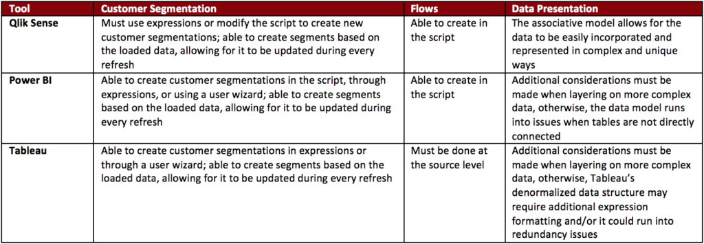
Once the data was loaded into the applications, Qlik Sense is able to differentiate itself from the other two products by the final data model it is able to utilize. Qlik’s associative data model allows Qlik Sense to string together connections between each table with every other table in the data model. This allows users to develop unique analyses across seemingly disparate data tables. While Tableau and Power BI are also able to bring in multiple data sets and data sources into their models, as users add on varying layers of complexity to the data model, they must also be more cognizant of the impacts on the data model.
For more information around each application’s connectivity, scripting, data load times, data compression abilities, and data modeling strengths and weaknesses, please see our full Data Wars whitepaper:
Data Loading Breakdown
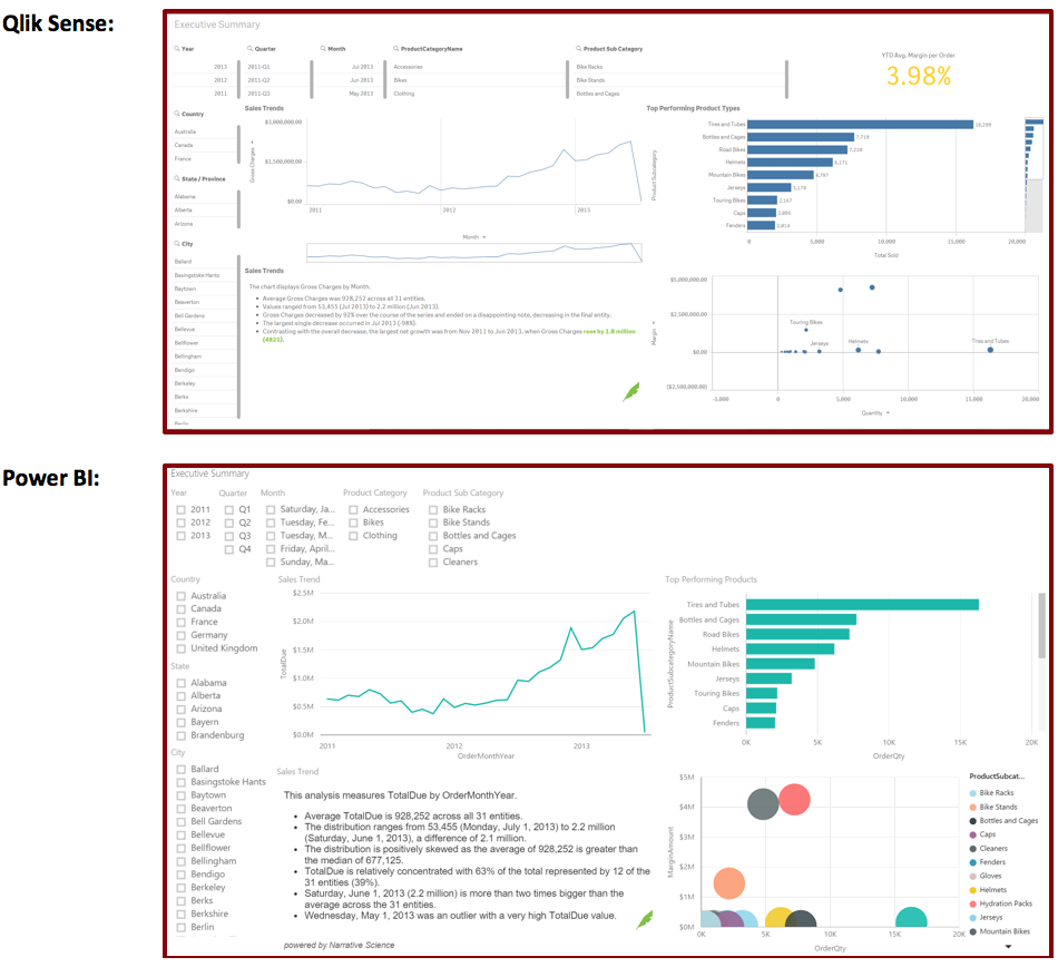
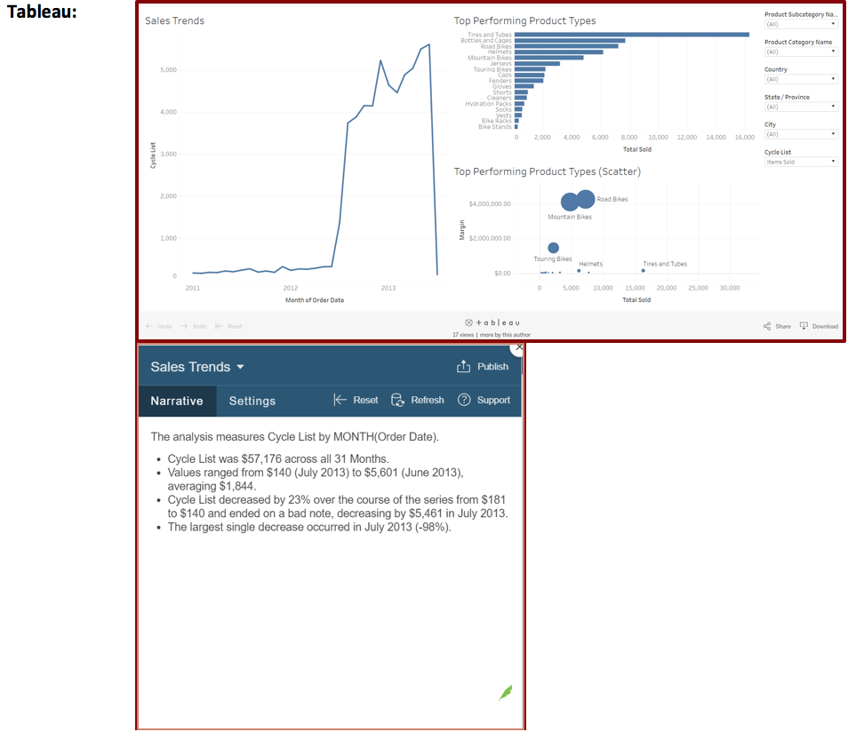
Not surprisingly, all three of the tools were able to address our baseline reporting case—the Executive Dashboard.
As you can see, each tool was able to make a polished, user-friendly dashboard. Users are able to make line charts, scatter plots, and bar charts easily and can enhance them by adding filters. Furthermore, each of them supports a community of custom developed add-ons. The one we used here is by our friends at Tableau Augmented Analytics, formerly Narrative Science, (denoted by their logo). They have developed an add-on for Qlik Sense, Power BI, and Tableau that creates text summaries of your visualizations.
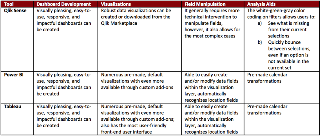
When it comes to Power BI vs Tableau vs Qlik from a default visualization standpoint, Tableau and Power BI came with more visualization types than Qlik Sense. While utilizing Qlik’s marketplace and customizing its standard visualizations allows Qlik Sense to make up some ground, this could be overly burdensome for less technical audiences.
Ultimately, we give a slight edge to Tableau in the visualization creation and organization space—the application’s interface has users create objects in separate tabs and then consolidate them into a single dashboard using a drag and drop design.
Tableau and Power BI also have an advantage when it comes to data manipulation on the visualization layer. They provide the user with wizards on the visualization layer to group fields, create hierarchies within fields, apply rules to fields, and create auto-filters for fields. The uses for these can range from making calendar fields (month, quarter, year, etc.) to developing drill down logic.
If users are embarking upon data discovery exercises, Qlik Sense’ white-green-gray filter functionality differentiates it from the other two. The white-green-gray color pattern defines whether a field is included in the current set, directly chosen for the current set, or excluded from the current set, respectively. This is useful in highlighting items like missed opportunities.
For further details around how the tools recognize field types (dates, locations, etc.), allow for heat map creation, enable users to build custom fields, and facilitate data discovers, please read out Data Wars whitepaper:
Executive Dashboard Development
With the basic use-cases covered, we wanted to see which tool handled some of our more complex business needs. The first that we looked into was customer segmentation. Many of our clients look to group their customers based on dynamic, automatically updated business rules. As this dataset was sales data, we decided to try and group them using the following:
- Whether someone was a New Customer (i.e. their first purchase was less than or equal to 60 days ago)
- How recently they purchased (grouped by 0 to 30 days, 30 to 60 days, 60 to 90 days, 90+ days)
- Whether someone was a repeat customer
- Whether someone was VIP Club Eligible (i.e. their average order was more than $1,0000)
Impressively, all of the tools were able to accomplish this segmentation. We used Qlik Sense’s and Power BI’s aforementioned scripting languages to develop these into the data model. For Tableau, we were able to string together multiple custom fields in the visualization layer to develop the needed segmentations.
Another key transformation in which our clients have found value is flows. This is used in customer service routing, order fulfillment, customer purchase pattern analysis, and other examples. Because of the ability to create custom scripts in Qlik Sense, we are able to recreate the logic for these. While we were unable to accomplish this with Power BI, we believe it could have been re-created with more time. Tableau would require the data to be prepared outside of the tool, likely in the source system.
For more information around how customer segmentations and flows were incorporated into the tools, please see our full Data Wars whitepaper:

Someone get Chewie a medal!
Summary
Here’s what we learned comparing Power BI vs Tableau vs Qlik:
- Qlik Sense provides the most value in regards to data manipulations and data modeling. Its SQL-esque script language will be familiar to many resources that are familiar with databases. The associative data model allows for unique analyses to be showcased to business users, potentially highlighting aspects of their organization they had not yet considered. The areas where we found that Qlik Sense fell short was in usability for non-technical users. It displayed a steeper learning curve than the other two products and most tasks required technical configuration.
- Power BI, despite being the newest of the products, showcased an impressive mix of technical functionality and non-technical user friendliness. The Power Query language allows for users to find a multitude of ways to address a problem, which, based on preference, can be seen as a positive or a negative. Microsoft has baked in a large standard list of visualizations as well as some nice additions to the front-end layer that make this an excellent tool for a non-technical user to learn and build upon that learning. The areas where Power BI struggled was in compressing the data and fully utilizing a normalized data model.
- While Tableau struggles in the more technical aspects of data manipulation and data modeling, it was the easiest to learn for our experimenter. For environments that rely heavily on IT to present the data but want a tool with which non-technical users can run with little technical background, Tableau is an excellent choice. After the initial pass through the analysis, users have to be wary about what additional drill-downs and complexity will impact the data model to ensure they report accurate data.
Enjoyed our journey, we hope you did—we certainly learned a lot and got to geek out a little. Stay tuned for more information as these tools evolve and shift and new tools are added to the in-memory analytics ecosystem. Maybe we’ll compare Power BI vs Tableau vs Qlik again. Or perhaps a new data visualization tool with in-memory analytics will arise.
Want to learn more about Kenway’s experience with Business Intelligence and data visualization tools? Drop us a line at info@kenwayconsulting.com.


