

The human brain can process entire images that the eye sees in as little as 13 milliseconds.
Regardless if you are the CEO, technology director, or compliance officer within your organization, information in the form of graphs and charts is not only easier to digest, but also promotes data-driven decision-making.
But there is a problem: Most organizations generate massive amounts of organizational data every day that is left unused, taking up storage in its rawest form. Consequently, teams are unaware of the data available to them, and if they are aware of it, they are unsure how to access or interpret it. Scattered and disorganized data requires hours of manual consolidation, cleansing, and validation, and the output is ultimately prone to manual errors.
If your teams are inundated with spreadsheets and spending an inordinate amount of time on gathering, cleansing, and reconciling disparate data sources manually rather than providing value-add analysis, then it might be time for a change.
If your organization’s leadership is not leveraging organizational data as a valuable asset to drive proactive risk mitigation and decision-making, then the real question is, “How much am I spending by NOT investing in my data?”
The cold, hard truth is that organizations can no longer afford to rely on spreadsheets and dirty data to make business decisions; however, data visualization can help to automate the consolidation and aggregation of data, equipping teams with the power to quickly interpret information to drive business results and increase overall team efficiency and satisfaction.
Before we cover how visualizing your data can help your organization, you may be wondering, what is data visualization?
Data visualization is the transformation of unstructured or raw data into a visual form to communicate complex data relationships and data-driven insights in a way that is captivating and easy to understand. By succinctly summarizing copious amounts of organizational information into visually appealing reports, teams do not have to dissect and analyze underlying data to understand trends over time.
Data visualization bridges the gap between data and action by providing access to real-time metrics, allowing businesses to be better positioned when it comes to:
In addition, data visualizations provide leaders the opportunity to harness existing data and leverage it to learn from past mistakes, build on past successes, and anticipate developments that drive innovation and accurately predict future outcomes.
The average organization collects data across 400 different sources. However, about 47% of that data goes completely unused because it is disorganized, unstructured, and dirty, which can cost your organization countless hours and dollars.
In order to fully realize the value that your data can offer, good data visualization is imperative. However, investing in data visualization tools and technologies without organizational buy-in or foundational data practices can actually prevent companies from maximizing ROI in the long run. In order to ensure sustainable value realization, you must first establish core data governance practices, clean up data sources, and determine the data needs of your organization.
Once these foundational data practices are in place, data visualization can deliver the following key benefits:
1. Increased Comprehensibility of Data and the Break Down of Data Silos
Because visual data is processed much faster by the human brain, presenting data in an easily consumable format has the incredible ability to streamline organizational production. In contrast to text form, which has more historically been used as the preferred medium for exchanging information, humans can process visual images 60,000x faster. Furthermore, data visualization provides a much more interactive approach to displaying data, thus allowing users to quickly understand the story the data is telling without needing words to provide context. Presenting data to your executives or teams in a visual manner allows for far fewer gaps in communication throughout the enterprise, which can ultimately shorten business meetings by 24% and give you and your teams more time for other value-add initiatives.
Additionally, data visualization can break down data silos within your organization and reduce the amount of time spent on manual reporting. Sixty percent of employees believe they could save six or more hours if static reporting was automated. Business Intelligence tools bridge the gap between siloed data and reporting by utilizing centralized data to display accessible visual reports. Ultimately, implementing a centralized Business Intelligence solution can help prevent wasted efforts on non-value-add activities, while also acting as a catalyst for cross-functional collaboration.
2. Save Costs & Drive ROI
How can visualizing your data really drive a return on investment? The answer to this question is unique to every organization and depends on the problem you are trying to solve; however, the competitive advantages to investing in Business Intelligence are as follows:
In addition to understanding the tangible benefits of implementing a Business Intelligence solution, it is equally important to note the true costs of not having one. How much will a lack of visibility, process inefficiencies, employee unproductivity, and outdated IT enhancements cost your organization over time? Some potential costs to consider include:
While ROI looks different for every organization, statistics show that data visualization offers an average of $13.01 ROI on every dollar spent. Business Intelligence tools make your data centralized and easily accessible, so employees spend more time on business functions rather than compounding the problem large amounts of data can present.
The quantitative and qualitative benefits of implementing Business Intelligence tools are endless; however, to fully capitalize on your investment in data visualization, you will want to consider these five data visualization best practices:
1. Identify Your Most Critical Data
The first best practice is to establish a core set of data that is most relevant to the entire enterprise. By first defining the business impact you are striving to achieve from implementing data visualization, you can then identify your most critical data element. Are you hoping to:
Once you identify your most critical data elements, you can begin to strategically and actively reduce the volume of data you do not need and acquire new data elements to paint a holistic picture of your organization.
2. Establish Data Governance
Establishing data governance to aggregate and organize by effectively managing data definitions and values is imperative to lay the foundation for sustainable value realization from an investment in data visualization. A few key first steps include:
But these steps are only the beginning. Keep in mind that data management requires ongoing evaluation of data quality to best promote accurate reporting.
3. Implement a Centralized Data Model
In order to blend data sources into cohesive visualizations, it is best practice to create a centralized data repository. Whether the aggregation occurs within a reporting tool itself or reporting database, it is imperative to blend data sources to provide cross-functional reporting. Benefits of having a centralized data model include:
4. Create a Data-Driven Culture
A key consideration of any digital transformation is to ensure employees within the organization embrace the new technology. In order to increase adoption and combat any resistance to change, it is essential to develop a cultural framework that motivates your employees to leverage the Business Intelligence tools available to them. Of course, this is easier said than done. Today, only 24% of companies admit to having a truly data-driven culture. A few challenges to overcome include:
In spite of these challenges, a data-driven culture is possible to achieve. You set yourself up for success when:
5. Know the Audience
Another data visualization best practice is to know your audience. When designing reports, it is important to understand who is the intended audience of the report and what information the end-user needs. For example, executive-level audiences will require a different level of granularity than employees completing day-to-day tasks. A few dashboards to consider to variate data visualization for different audiences include the following:
Rather than just displaying information that was previously in PowerPoint into a Business Intelligence tool, you can fully harness the power of data visualization by asking questions such as:
From there, you can design the right reports by leveraging data to surface actionable insights and improve business performance.
While there is no one-size-fits-all solution when it comes to visual analytics, at Kenway Consulting, our expertise and obsession with all things data have helped us paint the picture of transformative business opportunities for organizations just like yours. Here are a few examples of how Kenway has used data visualization to help small businesses to large, global enterprises alike.
A mobile application company developed an app focused on virtual engagement to provide cultural institutions with enhanced experiences for their visitors. The application collected large amounts of data from its users but had no way to make that data insightful for clients. The organization was looking for an analytics platform that could:
Kenway developed a fully automated, end-to-end process to support the visualizations needed to help the client’s customers understand the value of their data and make informed decisions. The reports created provided insight into who was visiting their institutions, where visitors were spending most of their time, the most-visited areas of the property, and more.
Read the full case study here.
A leading asset management firm had the goal of harnessing massive amounts of data to become more strategic and intentional in targeting its wealth advisor clients. However, due to numerous data inefficiencies and process gaps across the organization, it struggled to support its sales teams in understanding the full breadth of their relationships with current and potential clients. The company lacked real clarity around advisor profiles such as:
The main problems faced by the organization included:
Kenway collaborated with the business to understand its needs, analyze the current state, and work with technology teams to build a design that would deliver results. To ensure the organization was set up for success and continued growth, we took the unique approach of working together with the asset management company, as opposed to helicoptering in and leaving them with a design and recommendations that were not tailored to their needs.
This partnership also allowed the asset management company to cultivate institutional knowledge and build in-house capabilities and data visuals needed to support and adapt the modern data platform over time. This focus on enabling critical business outcomes built upon a solid baseline of governance and architectural capabilities helped to ensure sustainability and long-term success.
Read the full case study here.
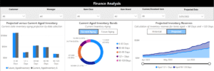
When it comes to your business, it is better to be proactive rather than reactive. While we cannot predict the future, business forecasting can help you prepare for potential outcomes. Data visualization can be especially helpful in the development of forecasting charts.
Forecasting charts analyze your descriptive analytics (historical data) over a specific period of time and provide predictive analytics, or trend lines, that extend past the current date to help you predict future business outcomes. Predictable forecasting can be beneficial when trying to:
At Kenway, we offer Business Intelligence solutions like Power Business Intelligence to bring your business-critical insights to life through customized reports and dashboards. Using applications such as What-If Analysis, your organization can plan for best-case and worst-case scenarios over the next 6-12 months.
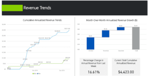
Data visualization can help your organization have better insights from customer data to quickly identify and capitalize on new market opportunities.
In order to identify new customers in new markets, you first need to have a strong understanding of your current customer base. Aggregating and cleansing customer data that is spread over a range of disparate sources, such as sales, accounting, and marketing, can be extremely time-consuming and near impossible through conventional methods and excel spreadsheets. Even if you manage to combine various data sources, surfacing meaningful insights based on criteria such as product line, region, demographic, or sales territory can prove to be even more difficult.
Blending disparate customer data within a Business Intelligence tool allows you to create standardized KPIs, metrics, and visuals to better analyze the characteristics of your current customer base in real-time and become more intentional and strategic with your go-to-market strategy.
Kenway has vast experience in leveraging analytics and data visualization to reveal a 360-degree view of your customers. To make this information even more powerful, Kenway can also blend external and internal datasets to present a macroeconomic view of your internal data trends.
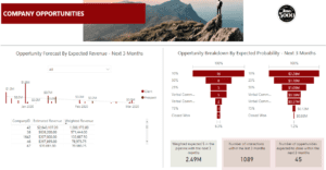
No matter how savvy your sales organization and business leaders are, their innate ability to identify new opportunities does not compete with a tool that can quickly analyze and consolidate terabytes of data.
There is no denying it: Enterprise data collection is not slowing down. In fact, over the next two years, it is expected to increase at a 42.2% annual growth rate. As the volume and complexity of data caches continue to proliferate, Business Intelligence and data visualization tools will enable your entire organization to consume the information being collected and make proactive business decisions.
Not sure how to navigate the future of your data? Kenway can help. From surveys and polls to decision support tools for the C-suite, our Power Business Intelligence portfolio highlights how our Business Intelligence engagements have helped transform data into consumable, interactive dashboards and reports that drive business-impacting decisions. Request a free data strategy consultation today.